MIT Media Lab
Creating a platform that reimagines how the MIT Media Lab collaborates and shares their work with the world.
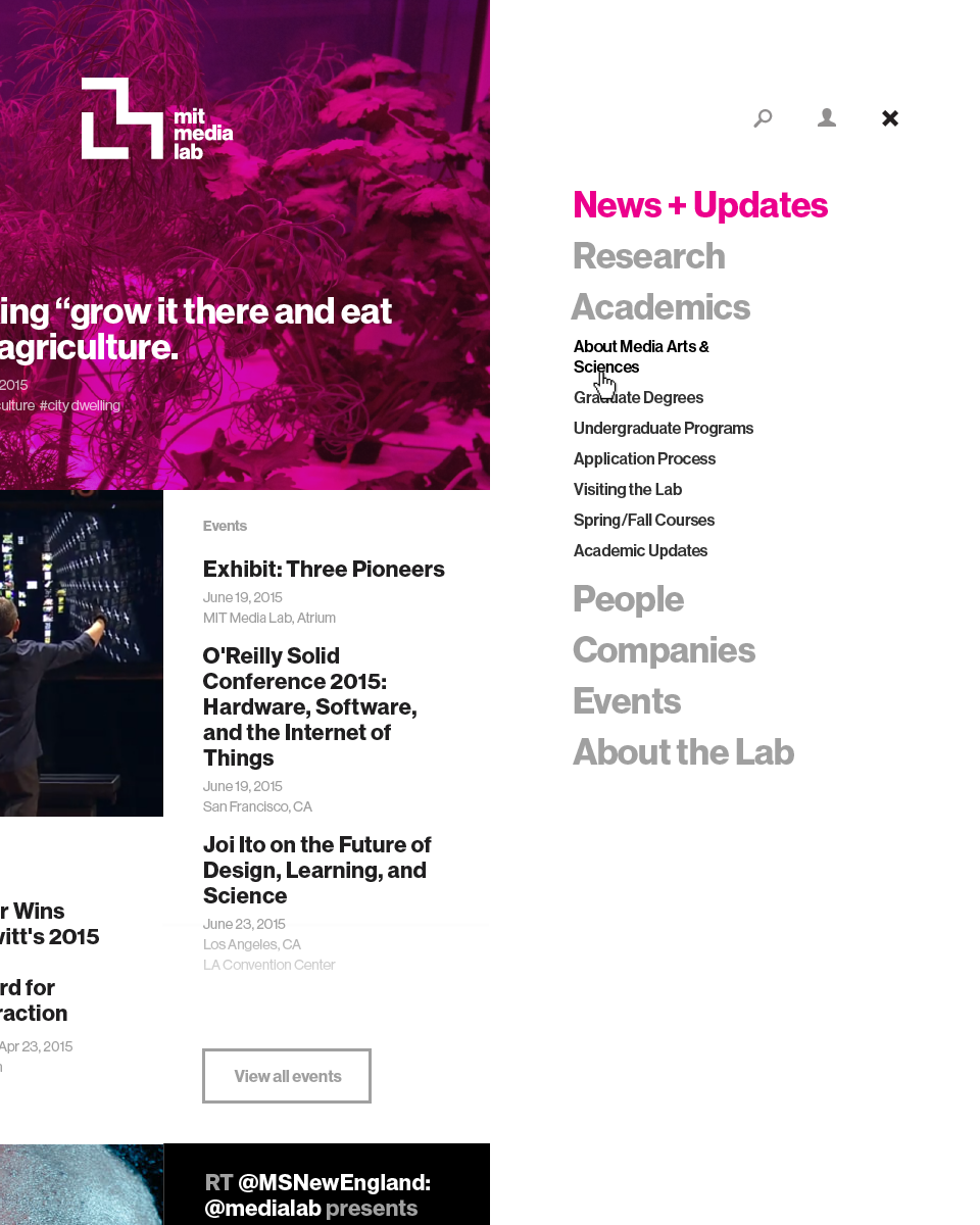
For over 30 years, the MIT Media Lab has been at the forefront of technological and scientific innovation, across an ever-growing intersection of disciplines. With breakthroughs ranging from e-ink to reactive prosthetic limbs, the Lab has fostered a unique environment through which its 30+ independent research groups and initiatives can invent the future.
When Type/Code and the Media Lab begin the project, they were wrestling with a 10-year-old website that brittlely integrated the dozens of external systems that had accrued over the years. Being heavily dependent on manual content curation by the Lab’s Communications team, there was a huge opportunity to turn the Lab’s website into a living window into all of the amazing work that was happening. It was time to craft a digital platform that reimagined how all the members of the Media Lab community could document and share their work internally, and seamlessly share their breakthroughs with the rest of the world.
Turning top-down into bottom-up
Through an in-depth Discovery process, Type/Code conducted dozens of interviews and collaborative working sessions with the Lab’s Communications team, IT team, researchers, faculty, administrative groups, and external collaborators. After analyzing hundreds of pages of interview transcripts, broader themes began to emerge across our user groups, ranging from transparency, to brand and mission unification, to improving workflow bottlenecks.
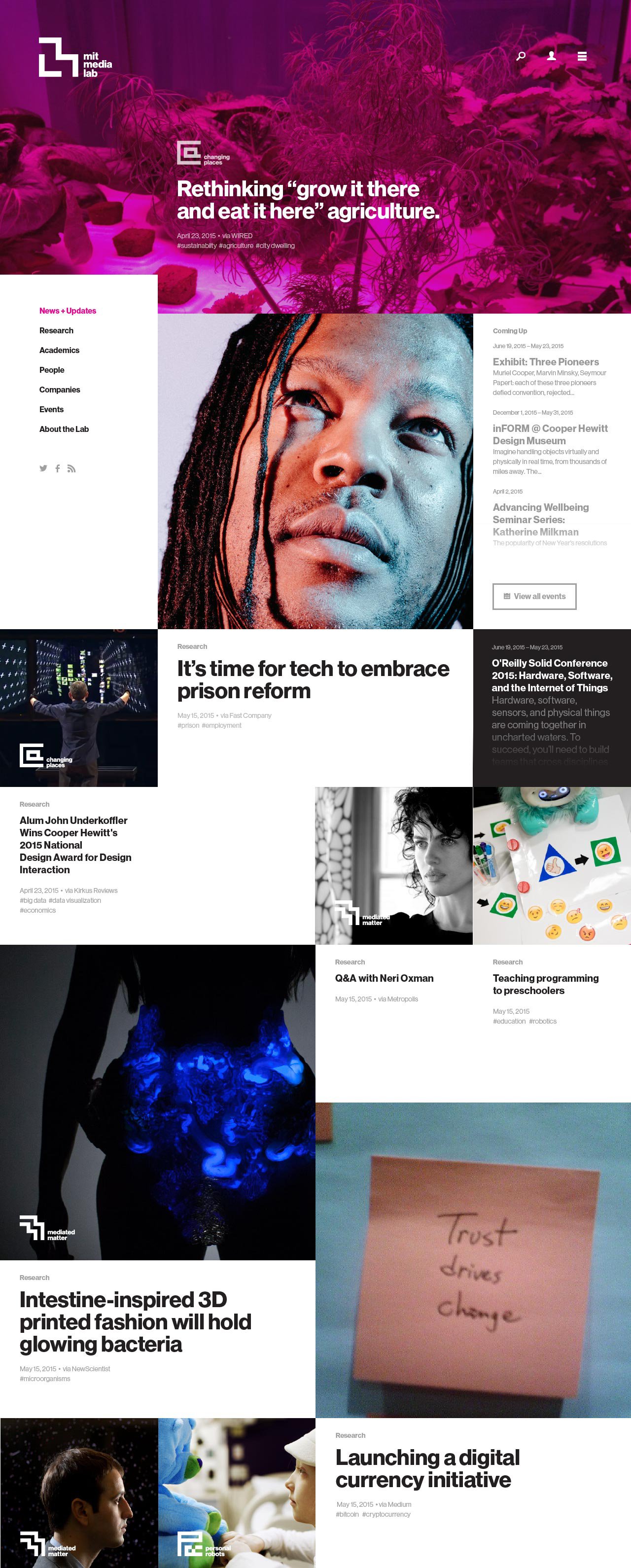 Home Page
 Research Landing Page
 Academics Page
If there was a message that we could get across to the world, it would be, ‘We discover the future.’— Lab researcher, during Discovery interviews
A significant opportunity was revealed to leverage the Lab’s culture of independent creation through a set of flexible, robust, and intuitive content-creation and management tools that would allow researchers to curate living profiles for their own groups, projects, and individual work.
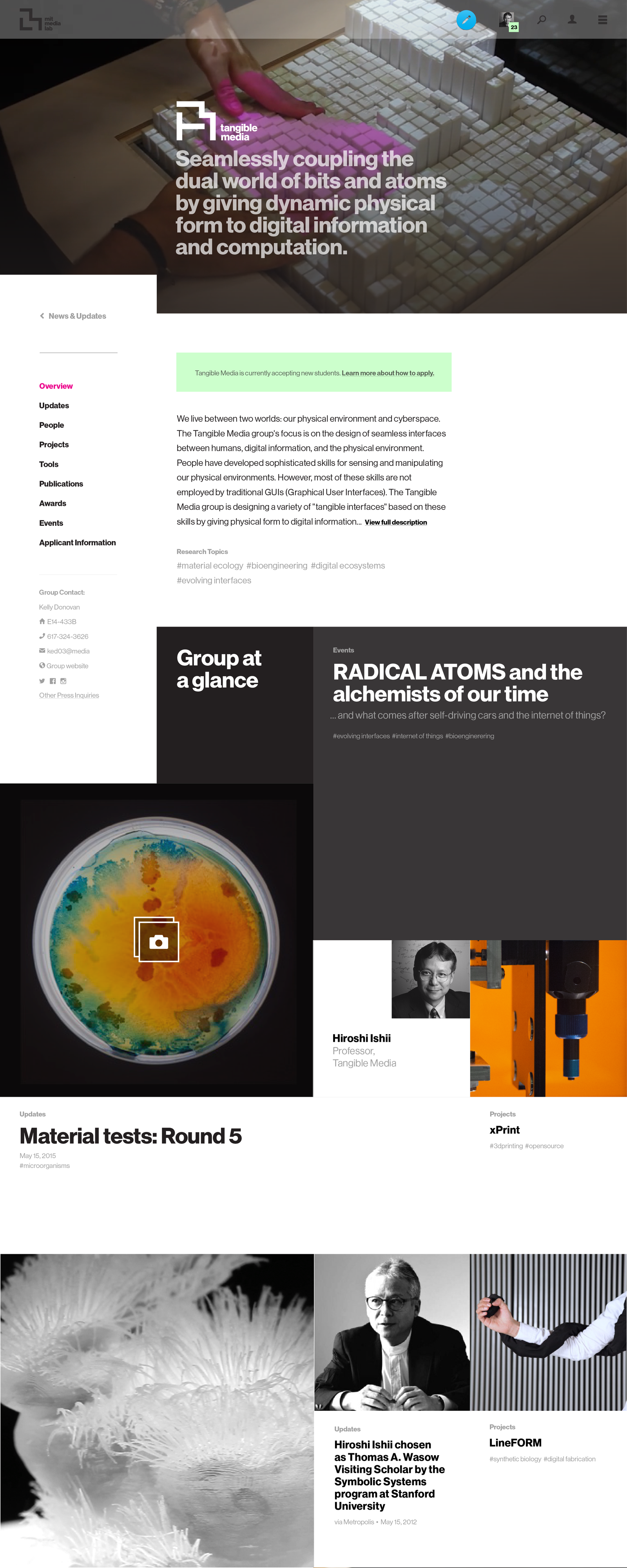 Group Profile
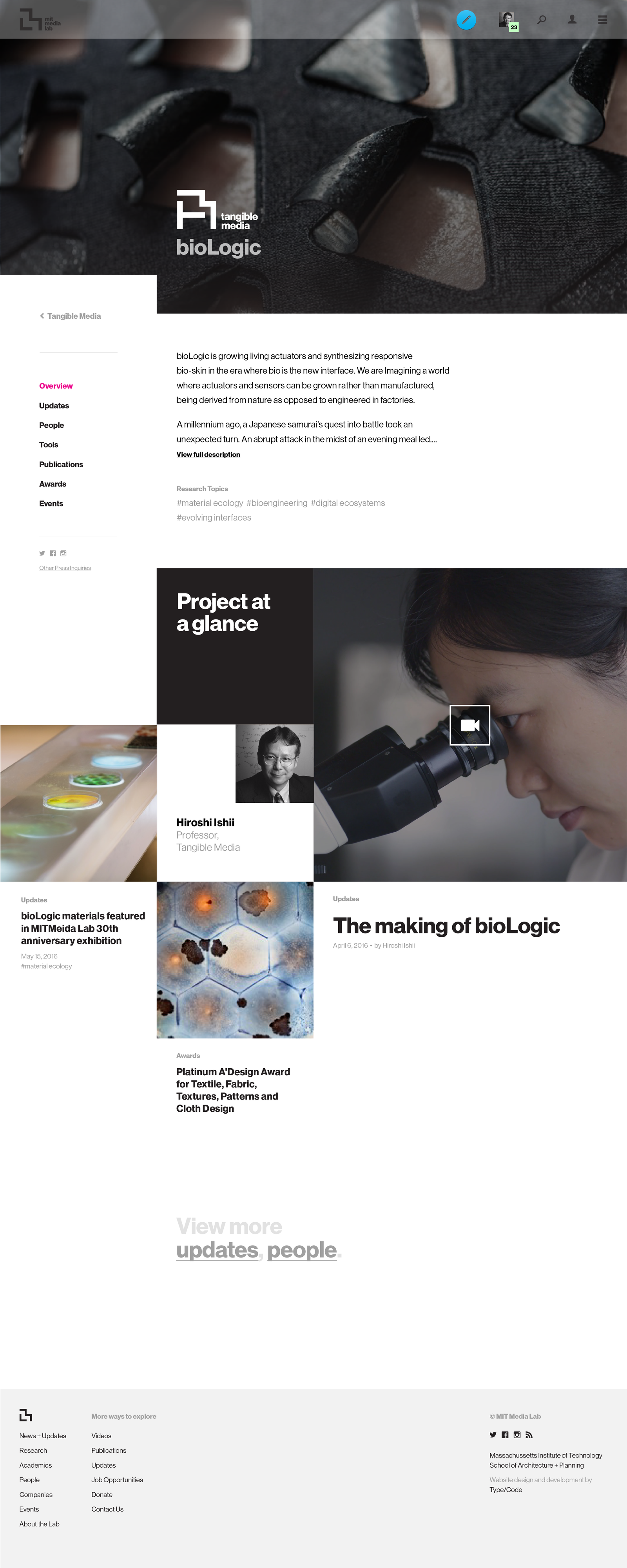 Project Profile
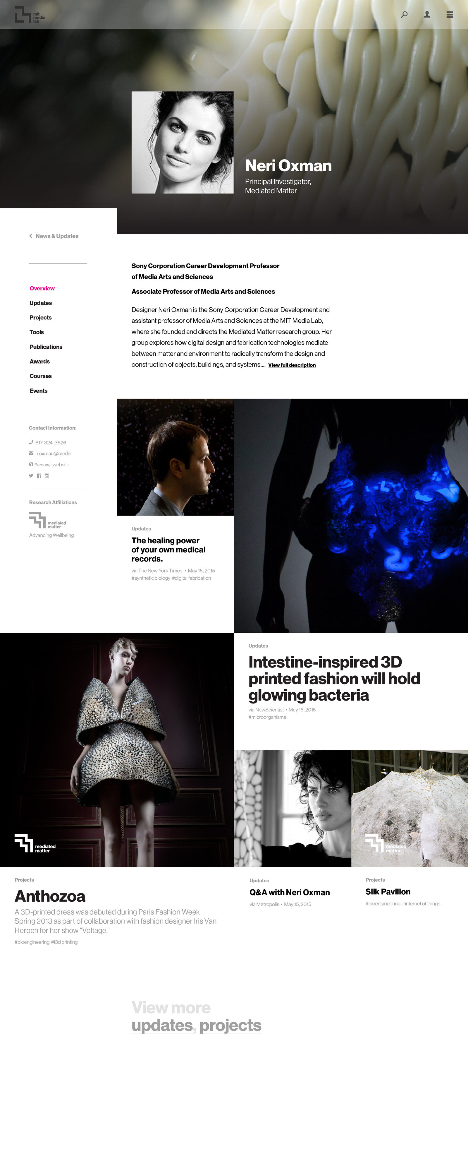 Person Profile
By giving everyone at the Lab content-creation and publishing tools, the need for previously existing external group and project websites could be negated, research work could be easily documented in real time, and the Lab’s Communications team could easily “bubble up” breakthroughs, right when they happen.
Entity Association
Through a powerful entity-association system, whenever a new piece of content is added to the site — whether a project, post, press, resource, academic publication, or video — it seamlessly flows across all related profiles for groups, projects, people, and informational sections of the site.Auto-flowing content
This allowed each group, project, and researcher’s profile to auto-populate with content, and reinforced our goal of “no dead ends”–no matter how you enter the Media Lab’s site, there is a deep path of fascinating related work to discover.Extending a modular brand system
The Lab had recently conducted an identity redesign, brilliantly executed by Pentagram. To balance the Lab’s need for a strong unified voice while still empowering the autonomy of each research group, the new brand system leveraged the previous identity’s 7x7 grid to create a Media Lab “glyph” for the Lab as a whole, along with unique glyphs for each research group.
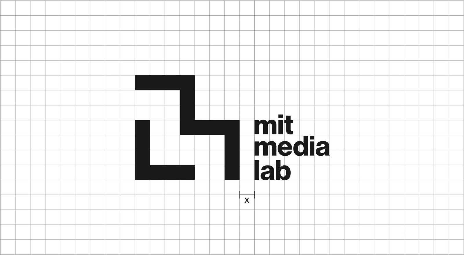
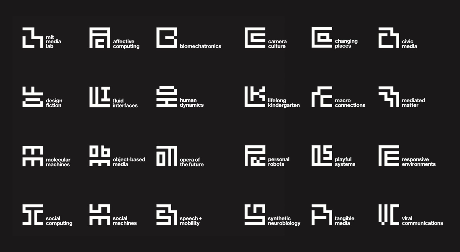
Playing with the idea of a square “pixel” as a visual mechanism to balance structure with infinite flexibility, Type/Code designed a visual interface system that fully embodied the brand’s visual language — embracing both a square grid system, with “blocks” of content flowing throughout that system, and the blocks of negative space resulting from the structured flow.
Making content creation intuitive and beautiful
Through our Discovery process, we found that one of the main reasons research groups were not regularly publishing progress updates on their work was because they did not have adequate tools. Beyond an internal Media Lab project database that needed to be updated twice a year, groups and researchers were relegated to using personal websites or blogs to document their work — and frankly, they had way more important research to be doing.
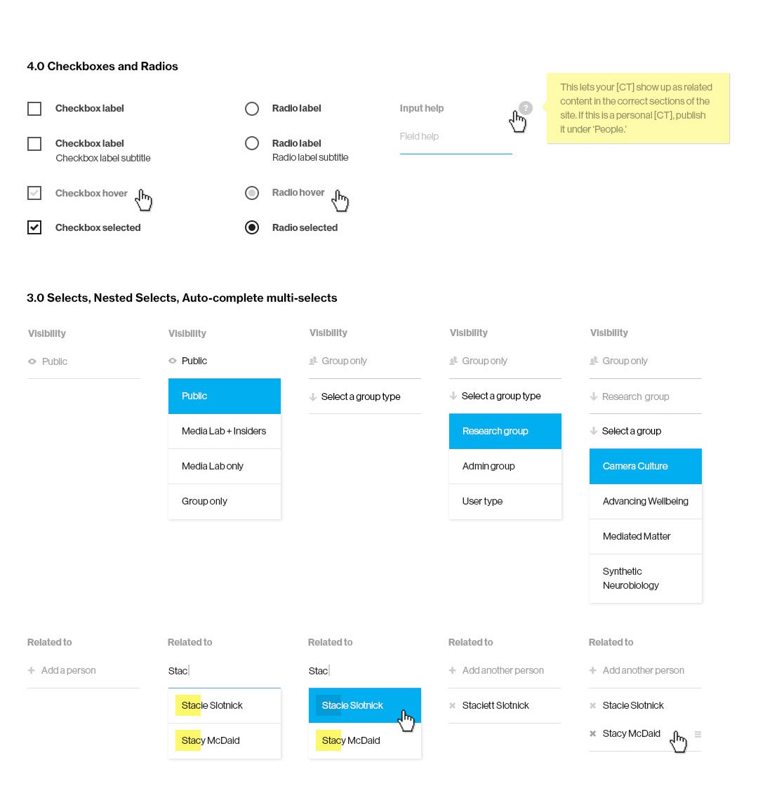
Type/Code designed a content-creation system that broke down the barrier between editing content and presenting content.
Through a modular (and extendable) set of “stream blocks,” researchers, the Communications team, and administrative groups are empowered with an ever-growing set of tools to facilitate the creation of various content types, ranging from media embeds, to FAQs, to rich dynamic blocks of other content from elsewhere on the site.

Designing an extendable asset management system
Beyond the need for powerful publishing tools and flexible content presentation models, the Media Lab had amassed vast amounts of content over its 30+ year history — with thousands of images, videos, and files scattered across a plethora of databases. While auditing the Lab’s existing systems during our Discovery process, it became clear that we should embark on a corollary effort to create a unified digital asset management system. After vetting several third-party tools against the Lab’s unique set of needs, we decided to design and build a custom solution.

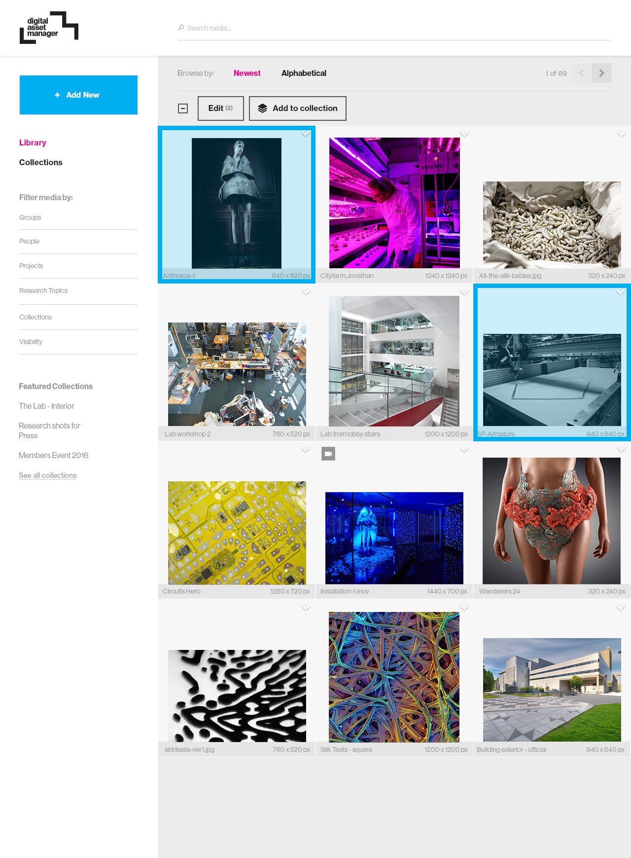

The initial phase of this process focused on what would be necessary to support the new website, while laying a strong foundation for an extendable asset manager that could facilitate asset organization across the Lab beyond the needs of the new website. While we have only scratched the service of this tangential resource, we were able to piggyback off of the new website’s association schema between people, projects, and groups; establishing clean and consistent metadata patterns for both migrated and newly added media as research groups began updating their content on the new website.
The results (so far...)
While the new Media Lab website has only been live to the public for a few months, we are already starting to see strong improvements in the engagement metrics that we were hoping for: deeper exploration paths with increased page views, increased number of average pages per session and average session times — and much lower bounce rates. Of little surprise with a fully responsive redesign, these improved metrics are looking even stronger across a growing segment of mobile and tablet visitors.
While the previous Media Lab site often served as jumping off point to external sources covering various projects, we’re starting to see the new website truly become its own destination, with double-digit growth across social and referral traffic.
The less quantifiable results of this redesign are continuing to manifest themselves. The Lab’s research groups, Communications team, and administrative staff are now truly making this platform their own, with a growing interconnected repository of beautifully curated work that begs to be explored.
Platforms of this scale are living things, and the public launch of this iteration of the Media Lab’s new website is just the first (very involved) chapter. Type/Code is excited to continue iterating and evolving this platform in response to how users at the Lab leverage their new toolsets, and how visitors engage with an ever-growing network of research.
Recognition
- Featured Webpick – Communication Arts
- Honoree, Best Academic Website (2017) – The Webby Awards
A24 Auctions →
A24 Screening Room